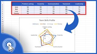
This video shows how to make radar charts, also known as spider charts or web charts, in R.
A radar chart allows you to display statistics across several different axes to generate an overall summary of an individual's scores across those attributes. Radar charts are usually used to display an individual's rating or skill level across multiple dimensions.
It can be difficult to read values on a radar chart precisely and the area of the polygon created by the bounds of the chart depends on the ordering of the axis labels, so they are typically best used to display information in a visually interesting way when precision is not a necessity.
Code used in this clip:
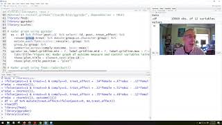
Radar chart with fmsb package
library(fmsb)
Basic Radar chart
Construct the data set (Data from Marvel.com)
data <- data.frame(Strength = c(7, 0, 6),
Speed = c(7, 0, 5),
Intelligence = c(7, 0, 6),
Fighting_Skills = c(7, 0, 4),
Energy = c(7, 0, 6),
Durability = c(7, 0, 6))
radarchart(data,
seg = 7, # Number of axis segments
title = "Iron Man Radar Chart",
pfcol = scales::alpha("gray", 0.3),
plwd = 2)
Radar chart with multiple overlapping individuals
Construct the data set
data <- data.frame(Strength = c(7, 0, 6, 7, 4, 3),
Speed = c(7, 0, 5, 7, 3, 2),
Intelligence = c(7, 0, 6, 2, 4, 3),
Fighting_Skills = c(7, 0, 4, 4, 4, 6),
Energy = c(7, 0, 6, 6, 1, 1),
Durability = c(7, 0, 6, 6, 3, 3),
row.names = c("max", "min", "Iron Man", "Thor",
"Spiderman", "Captain America"))
Define fill colors
colors_fill <- c(scales::alpha("gray", 0.1),
scales::alpha("gold", 0.1),
scales::alpha("tomato", 0.2),
scales::alpha("skyblue", 0.2))
Define line colors
colors_line <- c(scales::alpha("darkgray", 0.9),
scales::alpha("gold", 0.9),
scales::alpha("tomato", 0.9),
scales::alpha("royalblue", 0.9))
Create plot
radarchart(data,
seg = 7, # Number of axis segments
title = "Avengers Radar Chart",
pcol = colors_line,
pfcol = colors_fill,
plwd = 4)
Add a legend
legend(x=0.6,
y=1.35,
legend = rownames(data[-c(1,2),]),
bty = "n", pch=20 , col = colors_line, cex = 1.05, pt.cex = 3)
Marvel Hero data:
https://www.marvel.com/characters
Reference resource used to help make this video:
https://www.r-graph-gallery.com/143-s...
Code Clips are basic code explanations intended to be short reference guides that provide quick breakdowns and copy/paste access to code needed to accomplish common data science tasks.
Note: YouTube does not allow greater than or less than symbols in the text description, so the code above may not be exactly the same as the code shown in the video! For R that means I may use = for assignment and the special Unicode large < and > symbols in place of the standard sized ones for dplyr pipes and comparisons. These special symbols should work as expected for R code on Windows, but may need to be replaced with standard greater than and less than symbols for other operating systems.


Информация по комментариям в разработке