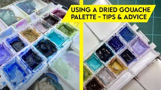
I did this study to practice color mixing for skin tones. Usually, I am much more intentional with brushstroke making, but here I allowed myself to be sloppier and just focused on color mixing. In nature, you can rarely see pure colors. Most of the colors in the surrounding world are muted because every object is affected by multiple light sources, shadows, and the ambient light. The sky, no matter how blue it may seem, cannot be painted with just a blue and white color mix. Its color is much more complex, containing reds, yellows, greens, and purples, depending on the time of day, the season, and the weather conditions. Grass is never just green either. Its color often contains browns, reds, and purples. In the same way, skin tones can’t be painted with just red or yellow mixed with white. They always contain greens, blues, and purples. That’s why on my palette you can see how for every shape in my painting, I mix a neutral color that leans towards a certain hue. The warm shadows are painted with a neutral leaning towards red, the skin tones in the light lean towards red, yellow, or purple. Even the colors that I used for the sea were mixed with a combination of blues, greens, and the warm yellows and reds that I had on my palette. The only times I used pure colors were when I painted the sunlit parts of the bikinis.
This is how my color mixing always is. Whether I paint a still life, a figure, or a landscape, I use my palette to mix neutral colors with different lightnesses, hues, and saturations. A neutral color always contains all three primaries: yellow, red, and blue, which means that all neutral colors harmonize perfectly with each other. Using them in painting makes it easier to capture the beauty of nature.
Materials used in this video:
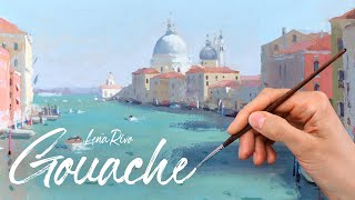
To paint the figures, I used a Raphael Precision 8524 brush no.2, and for the background, a no. 4 brush from the same line.
The paper is Saunders Waterford 150lb hot pressed watercolor paper slightly toned with a wash of a W&N gouache color called Neutral no.3.
If you want to learn about the colors I use on my palette, I've listed all of them in my free PDF guide to gouache available via the link provided below:
https://color-mastery.com/guide-to-go...
My favorite equipment for painting:
My Storage Palette for Gouache:
https://amzn.to/38Kzh1Z
Strathmore Mixed Media Boards. They are perfect for painting with gouache, especially if you are going to varnish your painting:
https://amzn.to/39Faf8y
Ampersand Aquabors. These are great for gouache, but I would recommend sanding them lightly to make the surface smoother:
https://amzn.to/3PLfwQQ
Arches Hot Press Watercolor Paper. This is the paper I use most of the time.
https://amzn.to/2QblESZ
Raphael Precision 8524 #2 and #4 brushes. These two are my favorite brushes. You can get them on dickblick:
https://www.dickblick.com/products/ra...
• • • • • • • • • • • • • • • • • • •
S O C I A L M E D I A
✿ Instagram: / lenarivo
✿ Website: https://lenarivo.com/
✿ Facebook: / lenarivoart
Music: epidemicsound.com
*Amazon links are affiliate links. If you choose to buy anything through these links, I'll make a small commission at no extra cost to you. Thanks for your support!


Информация по комментариям в разработке