💥 Get Your Shortcuts Cheat Sheet: »» https://www.up4excel.co.uk/shortcuts
🎯 Why clutter up your report with 2 charts, when you can put both data sets on both? It has to be the best way to compare 2 sets of results! Create stunning visualisations using 2 axis charts.
🥉 When the numbers in a chart vary widely from data series to data series, or when you have mixed types of data (price and volume), plot one or more data series on a secondary vertical (value) axis. The scale of the secondary vertical axis shows the values for the associated data series. A secondary axis works well in a chart that shows a combination of column and line charts. You can quickly show a chart like this by changing your chart to a combo chart.
To add a secondary axis to a chart:
Select a chart to open Chart Tools.
Select Design » Change Chart Type.
Select Combo » Cluster Column - Line on Secondary Axis.
Select Secondary Axis for the data series you want to show.
Select the drop-down arrow and choose Line.
Select OK.
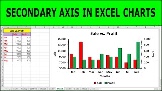
We start with a simple dataset, where the sales numbers are much larger than the profit numbers. After creating a basic chart, I’ll show you how to highlight the profit data by adjusting the chart to display it on a secondary axis. You’ll learn how to manage different chart types in combination, such as a bar and line chart, to represent two data series on one chart. By using dual axis charts, you’ll be able to display both data sets clearly, even when they have vastly different values.
Here’s a breakdown of the key topics covered in this tutorial:
First, we cover how to quickly create a basic chart in Excel using keyboard shortcuts like Ctrl + Shift + Arrow keys to select data and Alt + F1 to insert a chart. While this creates a standard chart, the profit numbers are too small to be easily visible compared to the sales data. This is where a dual axis chart comes into play. I’ll show you how to apply this technique to make the profit data more prominent and easier to interpret alongside the sales figures.
Next, I’ll guide you through the process of applying a secondary axis. This allows you to scale the profit data differently, making it visually comparable to the sales data, even though they have different ranges. By selecting the series you want to add to the secondary axis, and adjusting the settings, you can change how the data is displayed. This is an essential step if you want to accurately represent data with large differences in scale. You'll get practical, step-by-step instructions on how to set up the secondary axis and make your charts more readable.
I then explain how to adjust the chart’s appearance to improve clarity. You’ll learn how to adjust the gap width between bars to make the chart less cluttered, allowing the data to be clearly visible. I also go over how to change the chart types for each series. For example, you can use a combination of bar and line charts to show sales as bars and profit as a line. This not only makes the chart easier to read but also helps to draw attention to the key insights, such as which periods were more profitable, regardless of the scale of sales.
Lastly, I cover how to interpret the results of your dual axis chart. By analyzing the chart, you’ll be able to quickly spot trends and outliers. For example, it becomes easy to see which quarter had the highest profit and how it compares to sales performance. You’ll understand how dual axis charts give you an immediate visual representation of data, making it simpler to identify which periods performed better in terms of profitability and sales volume.
Throughout this video, I focus on providing actionable insights that you can implement immediately. The skills you learn here will not only help you create more effective charts but also enhance your ability to make data-driven decisions quickly. You'll be able to create more complex, informative charts that communicate your data’s story in a clear, concise way.
If you want to increase your Excel proficiency and improve how you visualize and analyze data, this video will give you the practical skills to make dual axis charts with ease. You’ll learn how to compare different data series effectively, using both primary and secondary axes, and how to tailor chart types to your data. The results are clear: better charts, better data analysis, and more efficient decision-making.
By mastering dual axis charts in Excel, you’ll be able to make more insightful, professional-looking presentations that are easier for others to understand. Whether you're working with sales and profit data, or any other set of values that vary widely in scale, you’ll be able to apply the techniques taught here to make your charts more effective and your data analysis more powerful.


Информация по комментариям в разработке