Apsara Brand Revamp: Crafting the Future of Stationery with Almond Branding
Almond Branding spearheaded a transformative brand revamp for Apsara, India's leading stationery brand under Hindustan Pencils Pvt. Ltd.
Brand Challenge
The objective was to revamp Apsara's brand image to make it resonate with contemporary consumers, particularly appealing to children who are the primary end-users of the products.
Strategic Approach
Almond Branding's strategy encompassed a deep market analysis and multiple collaborative sessions with the Apsara brand team. By engaging directly with consumers—parents, children—and retailers, Almond gained essential insights into the brand's perception and market demands. Basis that a strategic game plan was crafted.
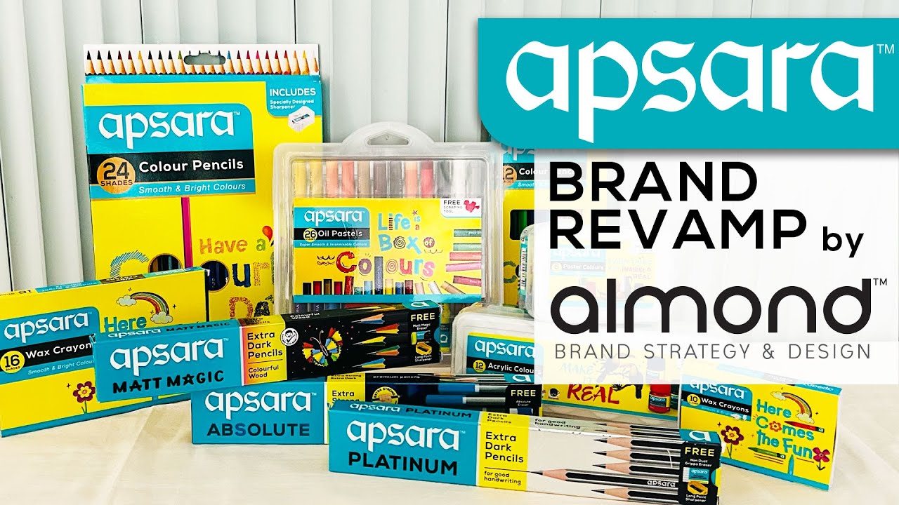
Almond Branding focused on establishing a unified visual identity for Apsara to ensure brand consistency and enhance its shelf presence. The team aimed to create a premium packaging design that would exceed customer expectations and solidify brand loyalty. This would involve selecting a single dominant colour to anchor the Apsara brand portfolio, making products easily identifiable by consumers and retailers, and ensuring that all products conveyed a unified, big brand feel.
Next was increasing the brand's relevance and appeal to make Apsara a brand that children are proud to own, viewed as stylish, innovative, new age, and trendy. This approach was intended to give the brand the necessary style quotient to resonate with today's youth.
The long-term goals were to elevate Apsara’s current market equity and establish it as a trusted, innovative, and progressive brand. Almond Branding also aimed to broaden the brand's reach beyond just pencils and associated stationery items, enhancing Apsara’s growth potential and pricing power in the competitive market. These objectives were designed to ensure Apsara's sustained leadership and influence in the stationery market.
Implementation
Almond Branding has handled many iconic brand revamps in the past and precisely calculating how much to change and how much to retain, comes from that experience.
Branding and Visual Identity
Almond Branding initiated the revamp by addressing inconsistencies in Apsara’s branding, particularly the colour and design of the logo across various media. A specific shade of turquoise was selected as the brand colour to ensure uniformity across all applications. The prominent usage of 'a' of Apsara in solidarity, is an iconic visual element and was suggested to be preserved to enhance brand recognition on shelves.
Apsara, as a brand, epitomizes the role of igniting imagination and revealing the inherent genius within children. The brand aims to foster inspiration and innovation for every child. Historically, Apsara pencils have been marketed for enhancing handwriting, with the promise of earning additional marks for exceptional penmanship. Almond believed that the original wordmark’s calligraphic style aligns seamlessly with this positioning.
Following extensive research, Almond recommended maintaining the logo's fundamental calligraphic feature while addressing minor distortions that emerged over its 50-year history. The Almond team meticulously refined the calligraphy, adjusting the font contours to simplify the logo for consistent and effortless reproduction across various media platforms, including digital, thereby ensuring its readiness for the future.
Packaging Design Strategy
A strict Visual Architecture was formulated to establish a rigorous visual hierarchy, meticulously specifying the placement and prominence of each element on the packaging. The Apsara brand's weightage and placement was standardized to ensure uniformity, addressing previous inconsistencies.
For pencil and related categories where Apsara has established dominance, the packaging design was enhanced while preserving the original visual elements and colour palette, ensuring a seamless and subtle transition. Conversely, within the realm of art materials—a sector where Apsara aims to expand its market presence—a vibrant new yellow colour scheme was introduced. This strategy is intended to bolster shelf visibility, aiding customers and retailers in easily distinguishing the products and facilitating the brand's association beyond merely pencils.
Outcomes and Future Directions
Post-revamp, Apsara has not only strengthened its position in the pencils and stationery market but has also made significant inroads into the art materials segment. The new packaging and unified brand identity have been well-received, contributing to increased brand recognition and consumer engagement.
Almond Branding's strategic revamp of Apsara has set a benchmark in the stationery industry, showcasing its prowess in brand transformation and market adaptation.


Информация по комментариям в разработке