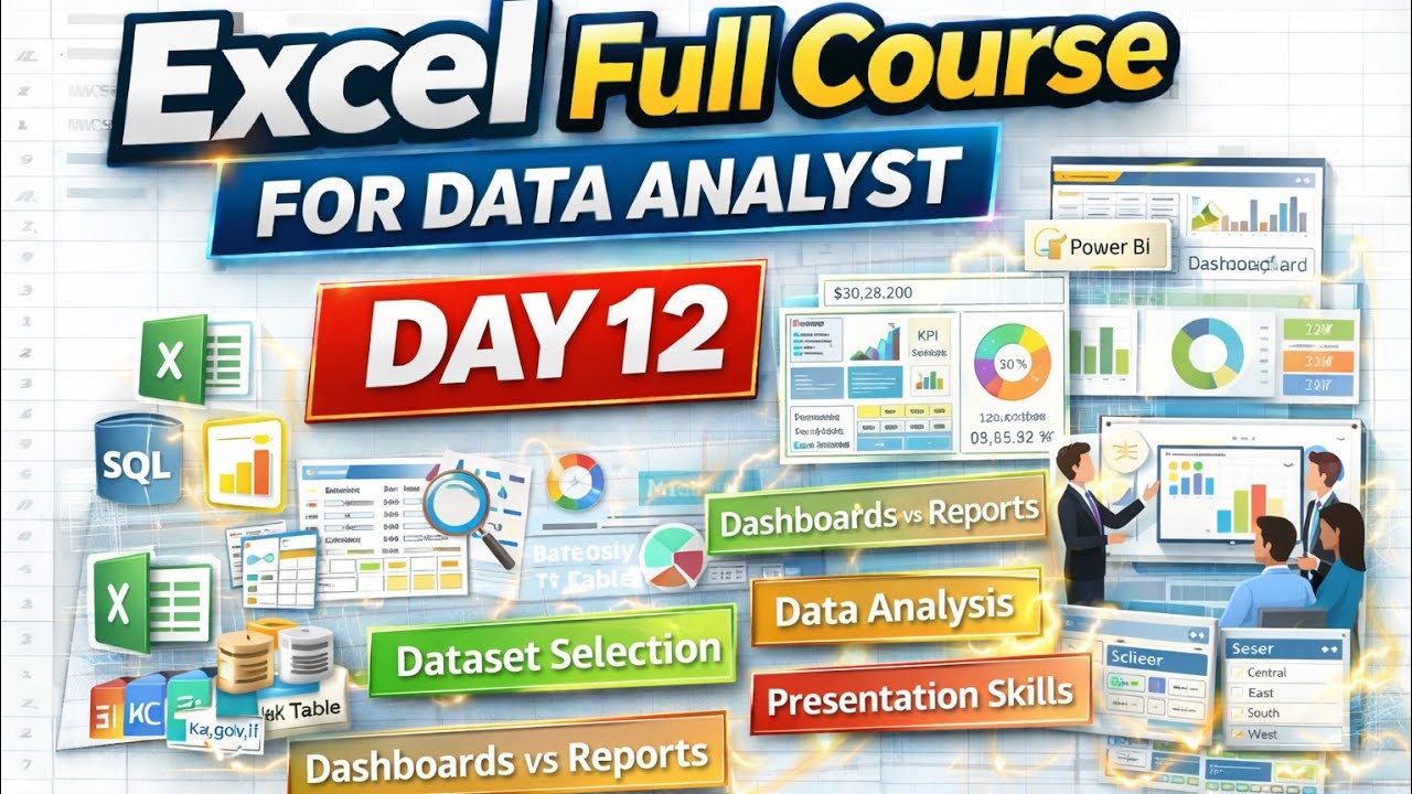
In Day 12 of the Excel Full Course, this session focuses on dashboard creation using Excel, while also explaining how Excel dashboards connect with Power BI, SQL, and real business decision-making.
This video goes beyond charts and pivots — it teaches how companies think about dashboards, where data comes from, how insights are extracted, and how dashboards are presented to managers and stakeholders.
You will learn the difference between reports and dashboards, types of data analysis, real-world challenges in dashboard building, and how to convert raw data into business insights using Excel Pivot Tables, Pivot Charts, Slicers, and Timelines.
This class is highly valuable for Data Analysts, BI aspirants, MIS professionals, business users, and students preparing for analytics roles.
⏱️ Video Timeline (Chapters)
00:00 – 02:54 | Dataset Sources & Availability
Where to find real datasets (Kaggle, Data.gov.in, IBM, academic portals)
Using datasets in Excel, SQL, and Power BI
Importance of data quality over quantity
Key Insight: Good dashboards start with good data.
02:55 – 06:05 | Dashboard vs Report & Types of Analysis
Difference between dashboards and reports
Single-page vs multi-page dashboards
Tabular data transformation
Univariate, Bivariate, and Multivariate analysis
Foundation: Knowing what to analyze before visualizing.
06:06 – 17:00 | Dashboard Creation Using Pivot Tables & Charts
Creating Pivot Tables in Excel
Sales, profit, and region-based analysis
Choosing correct chart types (line, clustered, etc.)
Basic dashboard layout design
Outcome: Turning raw data into visuals.
17:01 – 26:00 | Slicers, Timelines & Interactive Filters
Adding slicers and timelines
Filtering dashboards dynamically
Adjusting visual elements for clarity
Benefit: User-controlled dashboard experience.
26:01 – 33:44 | Real-World Data Analysis Challenges
Top regions, categories, and segments analysis
Identifying meaningful insights
Excel limitations vs Power BI capabilities
Reality Check: Excel dashboards need manual effort.
33:45 – 44:26 | Multi-Page Dashboards & Hyperlinking
Creating multi-page dashboards in Excel
Linking sheets using hyperlinks
Theme selection and layout fundamentals
Professional Touch: Structured and navigable dashboards.
44:27 – 59:54 | Insights, Remarks & Presentation Skills
Reading insights from dashboards
Highlighting positives and negatives
Presenting dashboards to managers
Business storytelling using data
Critical Skill: Insights matter more than charts.
59:55 – 01:19:22 | Technical Depth & Q&A
Excel formulas, VLOOKUP, Pivot Tables
Practical problem-solving through discussion
Data sensitivity and handling concerns
01:19:23 – 01:50:45 | Final Business Intelligence Perspective
Role of dashboards in business decisions
KPI selection and remarks importance
Time, effort, and mindset required
Recap of presentation philosophy
Final Message: Dashboards drive decisions, not decoration.
🔑 Key Takeaways
📊 Choosing the right dataset is the first step in analytics
📈 Pivot Tables and Charts are the backbone of Excel dashboards
🧩 Dashboards summarize KPIs; reports explain details
🎯 Univariate, Bivariate & Multivariate analysis improve insights
🤝 Presentation and communication are critical analyst skills
⏳ Excel dashboards require manual maintenance
👥 Analyst success depends on storytelling, not just tools
❓ Frequently Asked Questions (FAQs)
Q1: How do I choose the right dataset for dashboard practice?
Start with business-oriented datasets from platforms like Kaggle that include sales, profit, customers, and time.
Q2: What is the main difference between a dashboard and a report?
Dashboards show high-level KPIs visually, while reports provide detailed explanations.
Q3: Why are Pivot Tables essential for dashboards?
They allow fast, multi-dimensional data summarization.
Q4: How do slicers and timelines help?
They make dashboards interactive and user-driven.
Q5: What is the biggest challenge after building a dashboard?
Presenting insights clearly and supporting business decisions.
🎯 Conclusion
This session highlights that dashboard building is not just about visuals, but about thinking like a business analyst. From selecting the right data to presenting insights effectively, this video prepares learners to build meaningful Excel dashboards used in real companies.
Excel dashboards, when designed correctly, become powerful decision-support tools — especially when combined with Power BI, SQL, and analytical thinking.
📌 Action Steps:
Practice Pivot Tables and Pivot Charts daily
Build single-page and multi-page dashboards
Use slicers and timelines effectively
Focus on insights, not chart count
Improve presentation and storytelling skills
#ExcelDashboard
#ExcelForDataAnalyst
#PowerBIConcepts
#DataAnalytics
#BusinessIntelligence
#PivotTable
#ExcelVisualization
#DashboardDesign
#ExcelProjects
#AnalyticsSkills
#CodingAnalyticsWithAnkit

Информация по комментариям в разработке