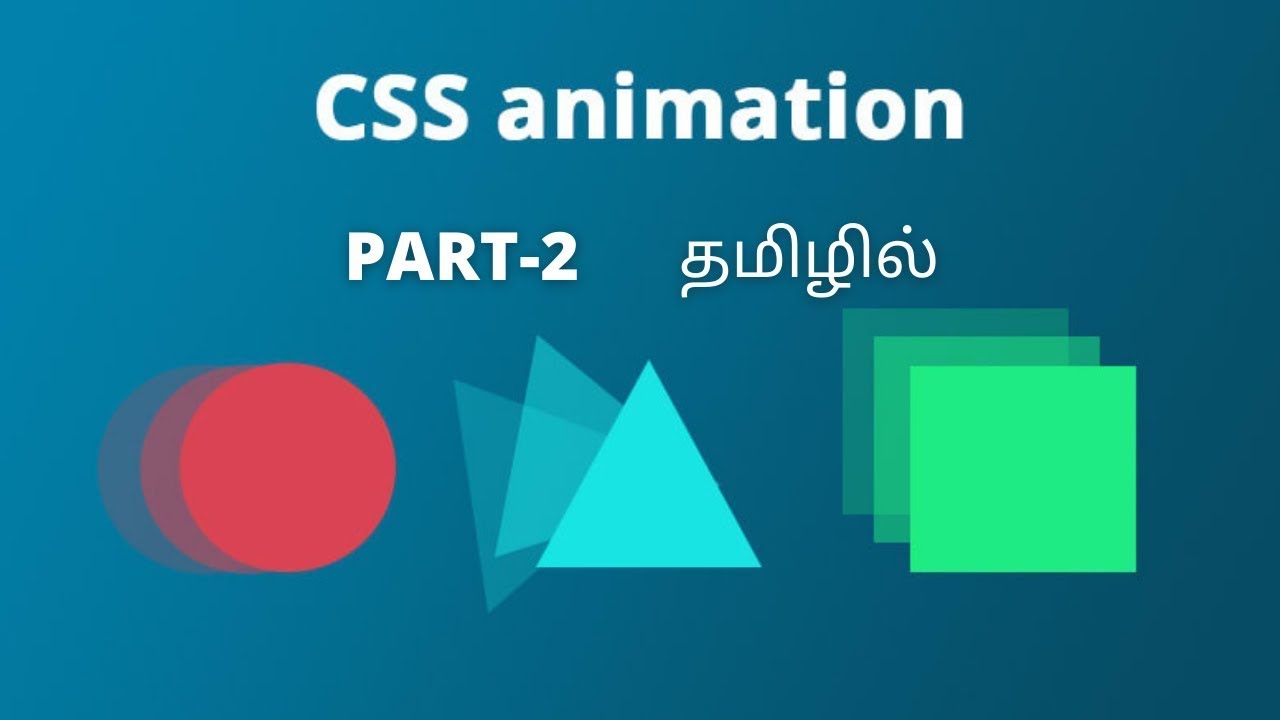
Welcome back to our CSS Animation Tutorial series! In this second part, we will delve into the powerful CSS transform property and its various functions: translate, rotate, scale, and skew. These functions allow you to manipulate elements in 2D space, creating dynamic and engaging web animations. By the end of this tutorial, you'll have a solid understanding of how to use these transform functions to create stunning visual effects on your web pages.
Why Learn CSS Transforms?
CSS transforms are essential for modern web design. They allow you to move, rotate, scale, and skew elements without affecting the surrounding content. This makes it possible to create complex animations and interactive effects that enhance user experience. Here are some reasons to master CSS transforms:
Versatile Effects: Create a wide range of animations, from simple transitions to complex, interactive effects.
Performance: Transforms are hardware-accelerated, making them more performance-friendly than other animation methods.
Ease of Use: CSS transforms are straightforward to use and integrate with other CSS properties like transitions and animations.
Design Flexibility: Provides more control over element positioning and transformations, allowing for creative design solutions.
What You'll Learn
In this tutorial, we will cover the following topics:
Introduction to CSS Transforms
Setting Up Your Development Environment
Using the transform Property
CSS translate Function
CSS rotate Function
CSS scale Function
CSS skew Function
Combining Transform Functions
Practical Examples and Use Cases
Common Pitfalls and Debugging Tips
Conclusion and Next Steps
1. Introduction to CSS Transforms
The CSS transform property allows you to apply 2D or 3D transformations to an element. This can include moving the element (translate), rotating it (rotate), resizing it (scale), and skewing it (skew). These transformations are applied directly to the element, without affecting the document flow.
Key Transform Functions
translate(x, y): Moves the element along the x and/or y-axis.
rotate(angle): Rotates the element by a specified angle.
scale(x, y): Scales the element along the x and/or y-axis.
skew(x-angle, y-angle): Skews the element along the x and/or y-axis.
2. Setting Up Your Development Environment
To follow along with this tutorial, you will need a text editor (such as Visual Studio Code) and a web browser (such as Google Chrome).
3. Using the transform Property
The transform property is used to apply transformations to an element. You can use it to move, rotate, scale, or skew an element.
4. CSS translate Function
The translate function moves an element from its current position. You can move it along the x-axis, y-axis, or both.
5. CSS rotate Function
The rotate function rotates an element around a fixed point (by default, its center). The syntax is rotate(angle), where angle is the degrees to rotate the element.
6. CSS scale Function
The scale function resizes an element. You can scale it along the x-axis, y-axis, or both. The syntax is scale(x, y), where x and y are the scaling factors.
7. CSS skew Function
The skew function skews an element along the x-axis, y-axis, or both. The syntax is skew(x-angle, y-angle).
8. Combining Transform Functions
You can combine multiple transform functions to create more complex animations. Simply separate the functions with spaces.
#cssanimationtamil #csstamil #csstransitiontamil #htmltamil #frontendforever #bootstraptamil #bootstrapintamil #cssanimationintamil #css #css3 #cssanimationtutorial #cssanimation #cssanimations #csstransition #csstamil #javascript #javascripttamil #javascripttutorial #frontend #frontendforever #frontendforever2.0 #webdevelopment #webdesign #threejs #csstransform #csstranslate #cssscale #cssskew #cssrotate


Информация по комментариям в разработке