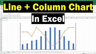
See how you can create your own combination charts, by changing a series' chart type, like this chart with a line and a column.
Watch this video to see the steps.
Visit this page for the written instructions.
https://www.contextures.com/linecolum...
Video Timeline:
0:00 Introduction
0:31 Create a Column Chart
0:49 Change Chart Series to Line
1:17 Put Line on Secondary Axis
Video Transcript
In Excel 2003, and earlier versions, when you inserted a chart, the chart wizard
opened.
You could see standard chart types, and there were also custom types, and some of these were combinations, like a Column - Area or Line - Column or Line - Column on 2 Axes
In newer versions of Excel, these combinations aren't available when you create a chart, but
you can easily turn any chart into a combination chart.
Here is the same data, in Excel 2010, and I'll insert a chart.
On the Ribbon, go to Insert, and I'll start with a Column chart and I'll use a
2-D column.
And here we can see cases and amount.
The cases are a much lower number than the amount, so we can barely see them here.
But with the chart selected, I can go to the Layout tab, and select cases.
Now all those columns are selected, even though we can barely see them.
I will right click on one of those, and click Change Series Chart Type.
And now, I can, instead of having that as column, I'll change that to a line
You can select any one of these lines.
I'll select the first one, without markers.
Click OK.
And now we can see that we do have columns and line together, in a single chart.
One of the old combination chart types was a Line-Column on 2 Axes, and that would be useful in this situation, where we can barely see one of the series.
So again, I will select cases series, and format the selection.
Right now it's on the primary axis, and I'll put it on the secondary axis.
And click Close.
Now we can see the cases much more clearly.
They're plotted on this secondary axis, which goes from 0 to 250, and the amounts are still on the primary axis, which goes from 0 to 18,000
So in newer versions of Excel, you can create your own combination charts, by right-clicking on a series, and changing its chart type.
For more Excel tips and tutorials, please visit my Contextures website, at www.contextures.com


Информация по комментариям в разработке