In this video we discuss what an ogive graph is, and how to construct make or draw an ogive cumulative frequency graph from a frequency distribution table in statistics.
Transcript/notes
Ogive graph
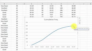
An ogive is a graph that represents the cumulative frequencies for the classes in a frequency distribution.
A ogive is a graph that provides a visual representation of the cumulative frequencies for the classes in a frequency distribution. It uses a line that connects the cumulative frequencies at the upper class boundaries for the classes for a frequency distribution.
In a past video we discussed what a frequency distribution is. Real quick, you have a data set, you break the data down into classes or intervals, column 1, you tally up how many data points are in each class, column 2, and you write that number down, which is the frequency, column 3.
So, the first thing we are going to do is draw an x and y axis. For the x axis, I am going to put this little squiggle in near the beginning of the line, and I will explain that later in this video. Next we need to label the zero’s, which is going to be where the x and y axes meet.
Next we need to label both of these axes. The y axis is going to be the cumulative frequency, and cumulative basically means the total amount of something. In this case the total amount of data points in the data set, which is 75. So, high up on the y or vertical axis we are going to mark 75.
Now we are going to make 7 more marks going down the y axis. Make these so they are the same distance from one another, or at least within reason if you are drawing this by hand. And we are going to label them, going down by 10, so 65 is the first mark below 75, then 55 and on down to 5 for the last mark.
The x or horizontal axis is going to represent whatever the data is, so let’s say this data represents sales. For the x axis, we are going to use upper class boundaries to mark it, so we need to calculate them. Since our data is all whole numbers, we can simply add 0.5 to the upper limits of each class.
So, for class 1 we get 174 + 0.5, which equals 174.5, for class 2 we get 223 + 0.5 which equals 223.5, and we continue for the rest of the remaining classes as you see in this table here. One other thing we are going to do is calculate the lower class boundary for class 1. For this we are going to subtract 0.5 from the lower class limit of class 1, 126, to get 125.5.
Now that we have the upper class boundaries, and the lower class boundary for the first class, we can label the x axis. This little squiggle here basically means a broken axis, or it lets the viewer know that there are some values kind of scrunched up here.
Somewhere to the right and near the squiggle we can mark the lower class boundary for class 1, 125.5. Next we will mark the upper class boundary for class 1, 174.5 here. Then 223.5, the upper class boundary for class 2 here and continue on marking all the upper class boundaries for the rest of the classes on the x axis as you see here. Again, make these so they are the same distance from one another, or at least within reason if you are drawing this by hand.
Next, we need to calculate the cumulative frequencies for each of the classes. So, for the 1st class we need to find the total amount of data points in the data set that are less than the upper class boundary of class 1, which is 174.5. We can see in the frequency distribution table, that there are 5 values that satisfy this.
For the second class, we have an upper class boundary of 223.5, and we can see from the table that there are a total of 10 values in the data set that are less than this, 5 in class 1, and 5 in class 2. For the 3rd class, there are 30 values less than 272.5, and we continue this process for the remaining classes. For the 7th and final class, we should have 75, because that is the total number of data points in the data set.
Now we are ready to plot the points on our graph starting with the lower class boundary for class 1, 125.5, which has a frequency or y value of zero. Next is the upper class boundary of class 1, 174.5 here on the x axis, where we have a cumulative frequency of 5, so we find our point of intersection, x equals 174.5 and y equals 5, and plot the first point.
Next would be the upper class boundary of class 2, 223.5, and our cumulative total or y value equals 10 here. Again, find our point of intersection and plot the second point.
Now that we have all of our points plotted, we will connect the dots, from class 1 to class 2 to class 3 and so on until we have all of the points connected.
Timestamps
0:00 What Is An Ogive Graph
0:17 Quick Frequency Distribution Review
0:26 Draw X And Y Axes
0:41 Label The Y Axis
0:53 Mark The Y Axis
1:19 Label The X Axis
1:24 Calculate Upper Class Boundaries
2:05 Mark The X Axis
2:43 Calculate Cumulative Frequency For Each Class
3:27 Plot Points On The Graph


Информация по комментариям в разработке