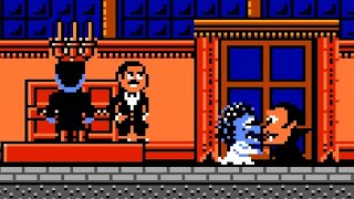
A playthrough of THQ's 1992 licensed-based platformer for the NES, Attack of the Killer Tomatoes.
Based on the cartoon which was in turn based on a cult-classic 70s B-movie, Attack of the Killer Tomatoes on the NES had some real potential to do something interesting with its premise. The plot is of course super cliched (evil scientist wants to take over the world, so go stop him), but with the goofiness of the cartoon and violently sentient vegetables taking center stage, the mind boggles at the possibilities of what Imagineering might have done with the game play. They did handle Bart vs. the Space Mutants, Ghoul School, and A Boy and His Blob, all highlighting how the studio was no stranger to the more "creative" side of things.
Unfortunately, Attack of the Killer Tomatoes does not quite match up to Imagineering's similar attempts at NES platformers based on existing IPs. It doesn't really feature any innovations (or "gimmicks," if you so prefer) in its gameplay, sticking fairly close to the standard hop-and-bop template. There are five extremely short stages and most of them involve climbing pipes and jumping on/squishing fanged tomatoes. Sometimes the path splits and you can choose which way to go (alternate paths typically lead to useless point power-ups), and there is the occasional "stage puzzle" that you'll have to figure out to move on, but everything is very simple and straightforward.
It's also extraordinarily easy. The controls are obnoxiously loose and floaty, and the collision detection will have you raging at times, but even with these issues, Attack of the Killer Tomatoes is about as unchallenging as NES action games come. Couple that with a total of about 20 minutes of game time, and you have something that had no business being sold for $39.99 in 1992.
The license doesn't really help the game either. There are a couple of neat little cutscenes to break up the monotony, but AotKT is usually an ugly game. Everything is murky and dark, and most of the levels are bathed in eye-gouging shades of green, pink, and purple. Regardless of how well detailed the graphics can be in spots, the most of the game is just so damned unattractive. It's so odd in that the people that made it clearly knew what they were doing - it's quite good on a technical level. Well alright, to be fair, the Miami Vice palm tree background in the first stage is pretty sweet, and the weird alien walls in the last level look amazing. The rest of it, not so much.
The audio is thoroughly grating, though. The theme song is barely recognizable, and the rest of the tunes are annoying enough to warrant hitting mute.
I generally like Imagineering's stuff on the NES, but I really have a hard time stomaching this one. It's not as dire as Rocky & Bullwinkle, Home Alone, or Wayne's World - it's reasonably playable - but if the best that can be said about a game is that it is not completely broken...well, that kind of sentiment hardly leaves one feeling enthusiastic, don't you think?
_
No cheats were used during the recording of this video.
NintendoComplete (http://www.nintendocomplete.com/) punches you in the face with in-depth reviews, screenshot archives, and music from classic 8-bit NES games!
Visit for the latest updates!
/ 540091756006560
/ nes_complete


![NES Longplay [381] Attack of the Killer Tomatoes](https://i.ytimg.com/vi/aKBRZKlsqBY/mqdefault.jpg)

![Game Boy Longplay [315] Attack of the Killer Tomatoes (US)](https://i.ytimg.com/vi/2ia4ofXW048/mqdefault.jpg)


Информация по комментариям в разработке