Giovanni is a flexible platform that allows a user to average remote-sensing data over time, create a range of plot types and formats, compare variables, and graphically display information.
Transcript:
Hello, this is Rhianna Miles, NASA HAQAST digital media specialist. Today I want to quickly show you NASA’s Giovanni. Giovanni is a flexible platform that allows a user to average remote-sensing data over time, create a range of plot types and formats, compare variables, and graphically display information.
I’m going to give you a basic introduction, but if you’d like a more detailed how-to, we’ve created a downloadable pdf version, which you can find on the HAQAST website: https://haqast.wiscweb.wisc.edu/wp-co...
We link to the Giovanni site on the HAQAST Tools page. You can get there by going to haqast.org. Under the ‘Tools and Resources’ tab, you’ll find a section called Tools. If you click on that, you can scroll down and find a link to Giovanni. If you click on Giovanni, it will bring you to the home page.
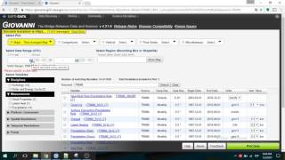
First, you need to select your Plot. I’d like a Time-Averaged map. I’m interested in nitrogen dioxide, so this type of map gives the average NO2 column over my region, for a selected time period. There are a few different maps you can choose from. Click the Details link beneath each to see which one is best suited for your purposes. The Time Averaged Map is what I’m looking for, so I’ll leave that highlighted.
Next, select a Date Range for which you would like to see data. I’m going to choose May 1st, 2016 to May 10th, 2016. You'll most likely choose a wider time period, but Time Averaged Maps take a long time to run, and the larger the date range, the more time you'll wait. Expect to be waiting for at least a few minutes, and possibly half an hour or so for wider ranges.
Now that I’ve chosen a date range, I need to choose the area that I’d like data for. You can either click on the bounding box to draw a box over the area you’d like data for, or you can select the shape of the area you’d like data for, which is useful if you’re interested in specific states, countries, or oceans. I’m interested in data for Wisconsin, so I’ll select Wisconsin.
Next, choose the variables you’d like to map. You can filter the measurements by discipline, but I’m just going to click on nitrogen dioxide. I’ll select the NO2 Tropospheric Column, and click ‘Plot Data.’
Now I’ll go get some coffee as my data is plotted…
This is the default map that’s generated by Giovanni. This doesn’t show much over my region, so I will rescale the contours and color to be more informative. There we go, that’s better! Now I can see the high and low values more clearly. If you’d like to learn how to do this, follow the instructions in our written how-to on our website: https://haqast.wiscweb.wisc.edu/wp-co...
You can download this data for your own use. To do so, click Download (a) and when prompted, choose the file format that works best for your needs.
To find out more about Giovanni, including how to generate scatter plots and other visual outputs, or for more free NASA tools, how-tos, and useful links, visit HAQAST’s NASA Tools page: https://haqast.org/nasa-tools/. Thank you.


Информация по комментариям в разработке