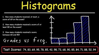
In this video we discuss what is a histogram, and how to construct make a histogram graph from a frequency distribution table in statistics. We go step by step through the process of constructing the graph and labeling the graph.
Transcript/notes (partial)
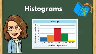
A histogram is basically a graph that provides a visual representation of a data frequency distribution. It is different from a vertical bar graph in that it has no gaps between the bars.
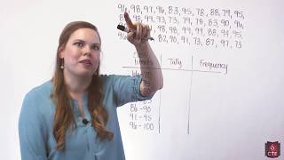
In a past video we discussed what a frequency distribution is. Real quick, you have a data set, you break the data down into classes or intervals, column 1, you tally up how many data points are in each class, column 2, and you write that number down, which is the frequency, column 3.
Now we want to take the data that we organized and summarized in the frequency distribution table and show/display it in a graph form, which makes it easier for many people to understand the data, and sometimes, it is easier to see patterns in the data from a graph.
So, the first thing we are going to do is draw an x and y axis. For the x axis, I am going to put this little squiggle in near the beginning of the line, and I will explain that later in this video. Next we need to label the zero’s, which is going to be where the x and y axes meet.
Next we need to label both of these axes. The y axis is easy, that is going to be the frequency, or the amount of data points in each class. If you look at the table, the largest number in the frequency column is 25 for the 4th class. So, knowing this, we can draw this line and mark it as 25 somewhere near the top of where our y axis ends. Then we are going to mark 20, 15, 10, and 5 on the y axis. When drawing by hand the increments between these marks doesn’t have to be perfect, just within reason, so that the distances between the marks look symmetrical.
The x axis is going to represent whatever the data is, so let’s say this data represents sales. But, before we label the x axis we need to calculate class boundaries for each of the classes. Consecutive bars in a histogram touch one another, so we need to calculate class boundaries for each of the classes. We cant use the class limits, because technically there would be a gap between bars. For instance, using class limits, the bars for class 1 and 2 would have a gap between 174 and 175, the upper limit of class 1 and lower limit of class 2. You could have 174.3, or 174.8 and so on.
Since our data is all whole numbers, we can simply subtract 0.5 from the lower limits of each class and add 0.5 to the upper limits of each class. So, the boundaries for class 1 will be 126 – 0.5 which equals 125.5, at the lower boundary and 174 + 0.5 which equals 174.5 as the upper boundary. And we will do this for the 6 remaining classes, as you see in this table
here.
Now that we have the class boundaries, we can label the x axis. This little squiggle here basically means a broken axis, or it lets the viewer know that there are some values kind of scrunched up here.
We can start by marking the value of the lower class boundary of class 1 somewhere to the right of our squiggly line. So, 125.5, here and then the upper class value of 174.5 off to the right. Next we need to mark the class boundaries for class 2 on the x axis, since the upper boundary of class one and the lower boundary of class 2 are the same, that value has already been marked, so we then mark 223.5, which is the upper boundary for class 2. When you mark this, you want to make the mark so the width of class 2 is the same, within reason, to the width of class 1 on the x axis, like this. Then 272.5, the upper boundary of class 3, 321.5, the upper boundary of class 4, and 370.5, 419.5, and 468.5 for the remaining upper class boundaries.
Next we want to mark our frequency, which is 5, from class 1 in respect to the y axis values. Then we can draw our lines in for the first bar and fill it in. Next mark the frequency for class 2, which is also 5, in respect to the y axis and draw in the lines and fill in the bar. For class 3 the frequency is 20, so again, mark it, draw in lines and fill in the bar. And continue this for the remaining classes, 25, 14, 4, and then 2.
Once you are finished, you can put the frequency values above the bars, as this gives the viewer a quicker way to view the histogram, rather than having to find a given bar’s value from the y axis.
Timestamps
0:00 What Is A Histogram?
0:15 Quick Frequency Distribution Review
0:33 Draw X And Y Axes
0:47 Label Y Axis
0:56 Mark Y Axis
1:15 Label X Axis
1:22 Find Class Boundaries
2:20 Mark X Axis
3:06 Mark Frequencies And Draw Bars


Информация по комментариям в разработке