Get Your Own: https://amzn.to/3rPVKqq
Unbox & Swatch Video: • A Hidden Gem- Rosa Galleria Watercolo...
Help support reviews and tutorials like this one by joining me on Patreon! patreon.com/nattosoup
More of my art:
Tiktok: / nattosoup
Youtube: / nattosoup
Instagram: / nattosoup
Mastodon: https://mastodon.art/web/@Nattosoup
My Webcomic: 7" Kara: 7inchkara.com
Did you have a totally different experience with Rosa Gallieria watercolors? Let me know down in the comments!
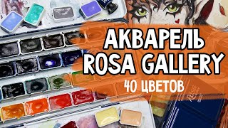
Rosa Galleria Fieldtest
These activate SO readily- you don't need to preactivate them at all, and a little really goes a long way with these, the opposite of all the other paints in the Student Grade Showdown. They do pollute the water fast, but I think it’s bc the paint tends to glob up on the brush quickly, so just be careful about color control.
I feel like these are drying kinda desaturated compared to how dark they are when applied. I also feel like maybe I’m seeing a bit of scaling with wet into wet blends.
It’s sorta strange, but with these, it almost feels like I’m painting on a hotpress, rather than Stonehenge coldpress. They just don't really wanna move a whole lot.
So sadly, once you add some water, these desaturate fast, and you lose a lot of color. I just can’t quite build up color the way I want to. They also tend to reactivate and move, and they cloud the lineart, so I’ll need to reink
So far, these just aren’t holding up as well as I had really hoped they would, but this isn’t over yet.
I’m really having difficulty getting the color I want, mainly with achieving nice greens using the blues and yellows. I ended up layering sap green on top of it, to get a better green. Generally Pthalo+cool yellow makes such a lovely green.
These also go down sorta opaque, so even if in past layers, you’ve built up some nice shading, glazing kinda ruins that, so grisaille isn’t a good technique with these
It’s just kinda hard to get these to do what I want them to do, which is surprising, bc they had a lot of promise. The fact that they desaturate so much as they dry is probably the biggest issue- the desaturation and the opacity are a bad combination
So these are definitely better than the Miya, but not as good as I’d hoped, and it might just be a personal issue? Like a combination of my paper, and me and how I like to paint just doesn’t work with these paints?
I really don’t love how lifting and reactivating these are- it makes them really prone to bleeding out into other colors, and impossible to glaze over certain segments (like with a plaid) bc the underlayer just melts.
For this illo to look up to my usual standard (if it’s even possible, I’m going to have to do a lot of cleanup with watercolor pencils and gouache.
Pros and Cons:
Pros:
Whole pans- the paint lasts a lot longer bc you’re getting more of it
Easier to get your brush into the whole pans as well
Quick activation- no need to preactivate
Good color selection- every color in this palette has its place, although! The two cool reds are kinda similar, and the burnt sienna and Venetian red are really close.
Cons:
These dry so desaturated, it really takes awhile to build up color
But also? These are all kinda opaque, so you really can’t rely on like wet into wet and grisaille and layering techniques to build up color
Because colors dry muddy and desaturated, it makes the work look more amateur than it should
Verdict:
This set really isn’t that bad for a student grade set- I’ve definitely reviewed a lot worse- but it’s still not as good as the Superior folding palette and the Meiliang pigments set. I definitely think this set is for someone- I also didn’t really like the White Nights 12 piece set, and people seem to love that set, so this might be a matter of use and taste in this instance. As an illustrator and comic artist who loves lots of layers, setting the mood with grisaille, and building up saturation, and as someone who paints tiny faces where muddiness is more noticeable, I have to say this set isn’t as good a fit for me as I had hoped.
For me, these drying as desaturated as they dry (it’s a pretty drastic color shift with mixed colors) is frustrating and kinda a deal killer, because it just desaturates my art in a way that I can’t fight.
Music:
Unfortunately, my music notes have been lost to the sands of time. Huge apologies- this happened to a batch of videos and is not going to become a regular thing.
#RosaGalleria #RosaGallery #RosaGallieriaWatercolors


Информация по комментариям в разработке